The tales revealed by the ‘flawed’ aspect of the picture
Part of the enjoyment of art is in the deciphering – the subjective, often highly personal ways in which we interpret what we see, as shaped by everything from our individual knowledge and experiences to where we see the art, the stories we’re told about the artist, how it’s made, and even the dimensionality of the work.
But what if there was a way of making ‘flat’ works three-dimensional? Or of learning about an artwork but looking at it the ‘wrong’ way around – from its back side, or ‘verso’? Those questions have been bothering archival photographer George Eksts, who has been “flipping over” works on paper from the V&A collection since 2015.
A new book, Reverses, from independent east London publisher CentreCentre in collaboration with the V&A, brings together 150 of these images that look to “reveal hidden stories behind the artist’s process and question the flat view of artwork, reframing paper as a three-dimensional object”.
This is the first collaboration between CentreCentre and V&A Publishing, and the project began when Patrick Fry, CentreCentre’s founder, saw Eksts’ collection on Instagram and was “immediately intrigued”, he says. Eksts has been an archival photographer at the V&A since 2007, and when archiving the thousands of works on paper he noticed the back of a Francis Frith landscape photograph.
“He shot the strange childish drawings on the reverse and began to build this archive alongside his official work at the museum,” Fry explains. “He saw them as worthy artworks that had gone unseen and undocumented…. The images seemed to have so much to say and yet there was so little information.”
Eksts had already collected thousands of images and presented them on Instagram. Fry found that entirely non-hierarchical, neutral approach to presentation fascinating in itself. “This collection offers nothing more in the way of information than a museum number for each artwork, deliberately moving away from expected information-led curation,” he says.
He approached Eksts with the idea of making a book from the collection back in 2019; and work soon began on the book alongside the V&A’s publishing team. “The ethos of CentreCentre as a space for unexpected collections fits in perfectly with George’s work,” says Fry.
This “egalitarian approach to image selection” directly informed the way the book itself was designed. “We didn’t want to single out a particular artwork as having more merit than any other, so the book has three covers each with unique images on the front and back,” Fry explains.
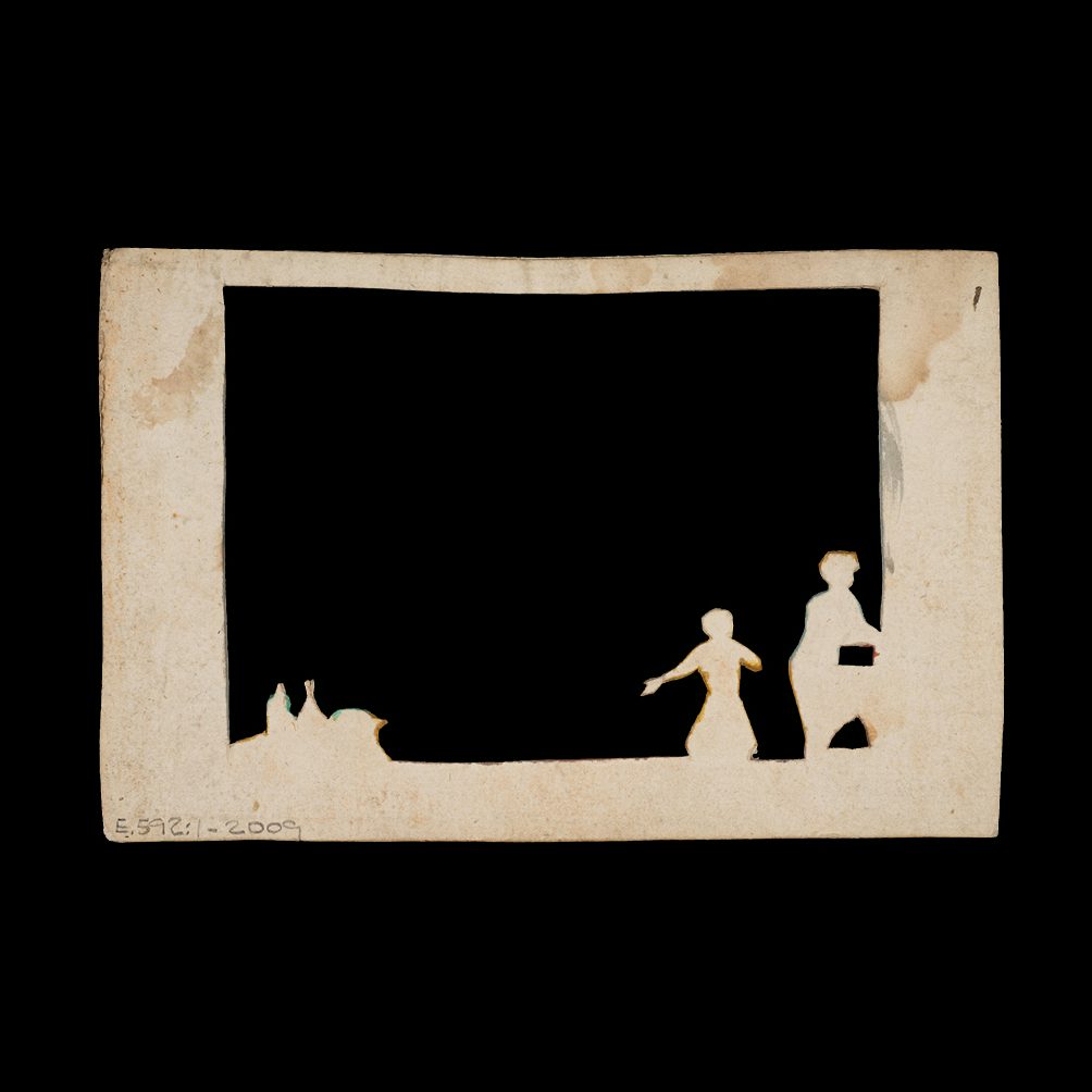
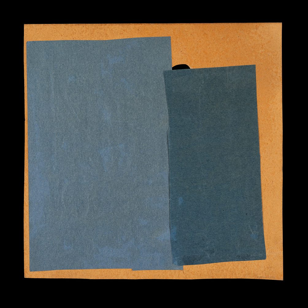
The first task was to create a “meaningful edit of the artworks” – no mean feat considering Eksts had photographed over 1,000 of these works and he had chosen to exclude any information about the artist or the ‘front’ of the artwork itself.
“So we set out to judge the artworks not by the established names of their creators but by the quality of the verso itself,” Fry explains. “They complete the story for any given recto and help us re-examine two-dimensional artworks as something more. They are artworks created by marks, damage, fragments of sketches, notes and remnants of reuse. Each of the reverses contain a clue to the object’s history, ownership and maker’s process, allowing us to complete a view that is normally hidden.”
After reducing the images down to 150, artworks were put into pairs to create each spread; selected for both their similarities and contrasts to create a compelling pace throughout the book. Text sections appear at the beginning and end of the book, which are printed on a lighter uncoated stock, Munken. “We wanted to create a playful nod to the reverses themselves so this paper has visible show-through, you can see the ‘reverse’ of each page as you read,” says Fry.
Typeface-wise, Monotype font Van Dijck was chosen primarily for its beautiful numerals, since numbers feature on every plate page. “These have a idiosyncratic quirk to them, just really unique characters that felt connected to the strange shapes and forms seen throughout the artworks,” says Fry. Grot 10 was introduced to balance out the “historic” feeling. “This may be a book full of ageing papers, many with ornate and masterful art, but the book is innately modern through its purposefully subversive approach to archival photography,” says Fry.
One of the biggest challenges of the project was the licensing – a complex process that required the publishing and design team to have the artworks listed as official entries in the V&A database. “A somewhat poetic bit of admin, as it validated the original idea of the collection, that these are important artworks despite their place on the ‘wrong’ side of the paper,” says Fry.
centrecentre.co.uk